
Case Studies
How Freeklime grew online conversion rate by 52%
When Freeklime expanded to three gyms, their old site couldn’t keep up—customers struggled to pick a location, and marketing had zero visibility. We rebuilt it from the ground up, creating clear, brand-aligned journeys and analytics that drove a 52% jump in conversion rate.
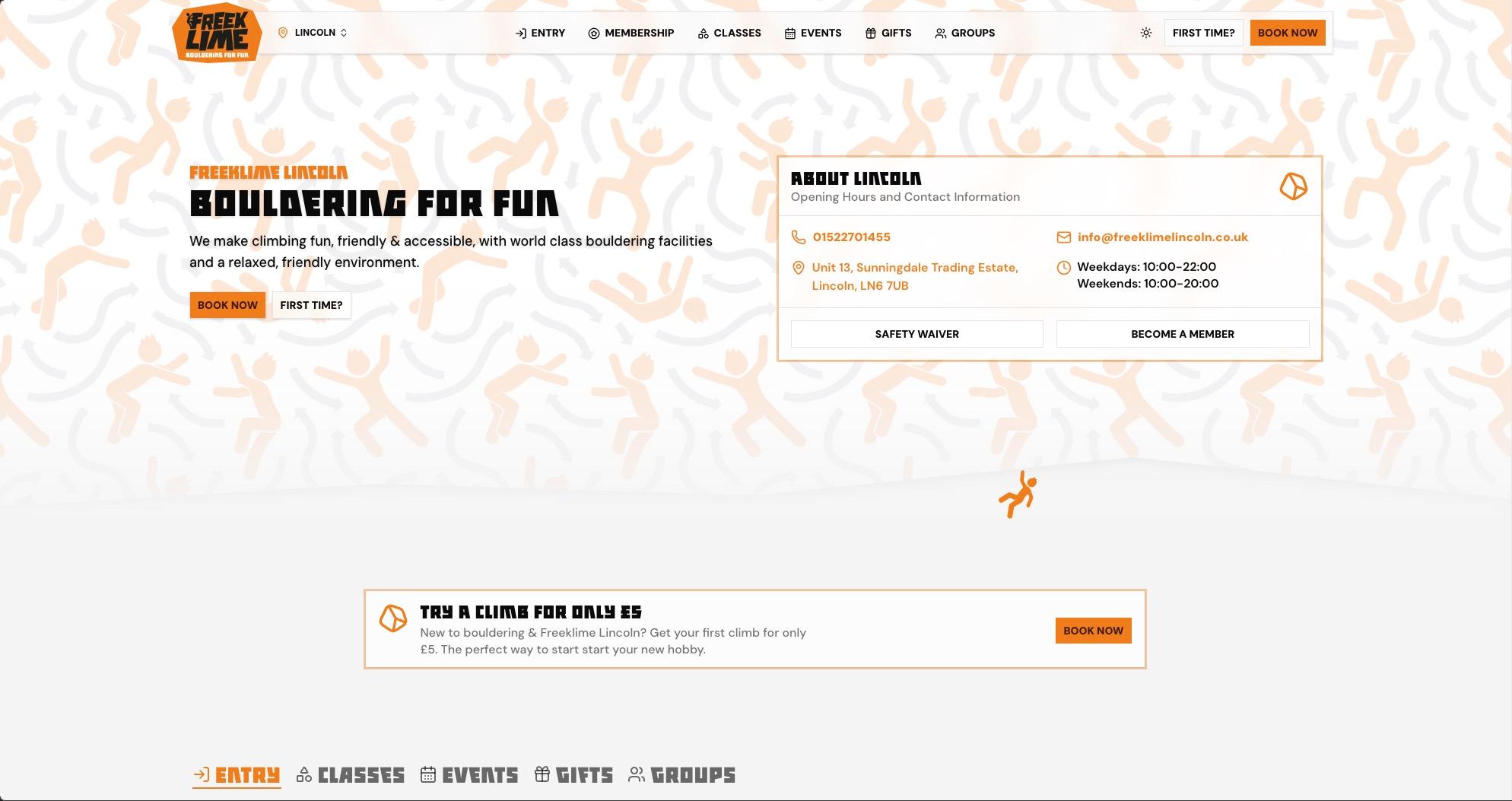
Freeklime Multi Venue Booking Site
Freeklime, an accessible bouldering provider with three locations across Yorkshire & East Midlands, needed a website that turned their strong brand into clear customer journeys that convert visitors.
“Huge thanks to Izak Jackson for the complete redesign of our website. We set out to make it more user‑friendly for first‑time visitors, make better use of our brand assets, and improve how we track ROI across our marketing. This new site sets FREEKLIME up for the next stage of growth as a multi‑site operator, and I’m absolutely psyched with the result.”

Conversion rate
Up 52%
Cart abandonment rate
Down 85%
Page speed
Up 21%
Online sales
Up 5%
Problem
The multi-site friction point
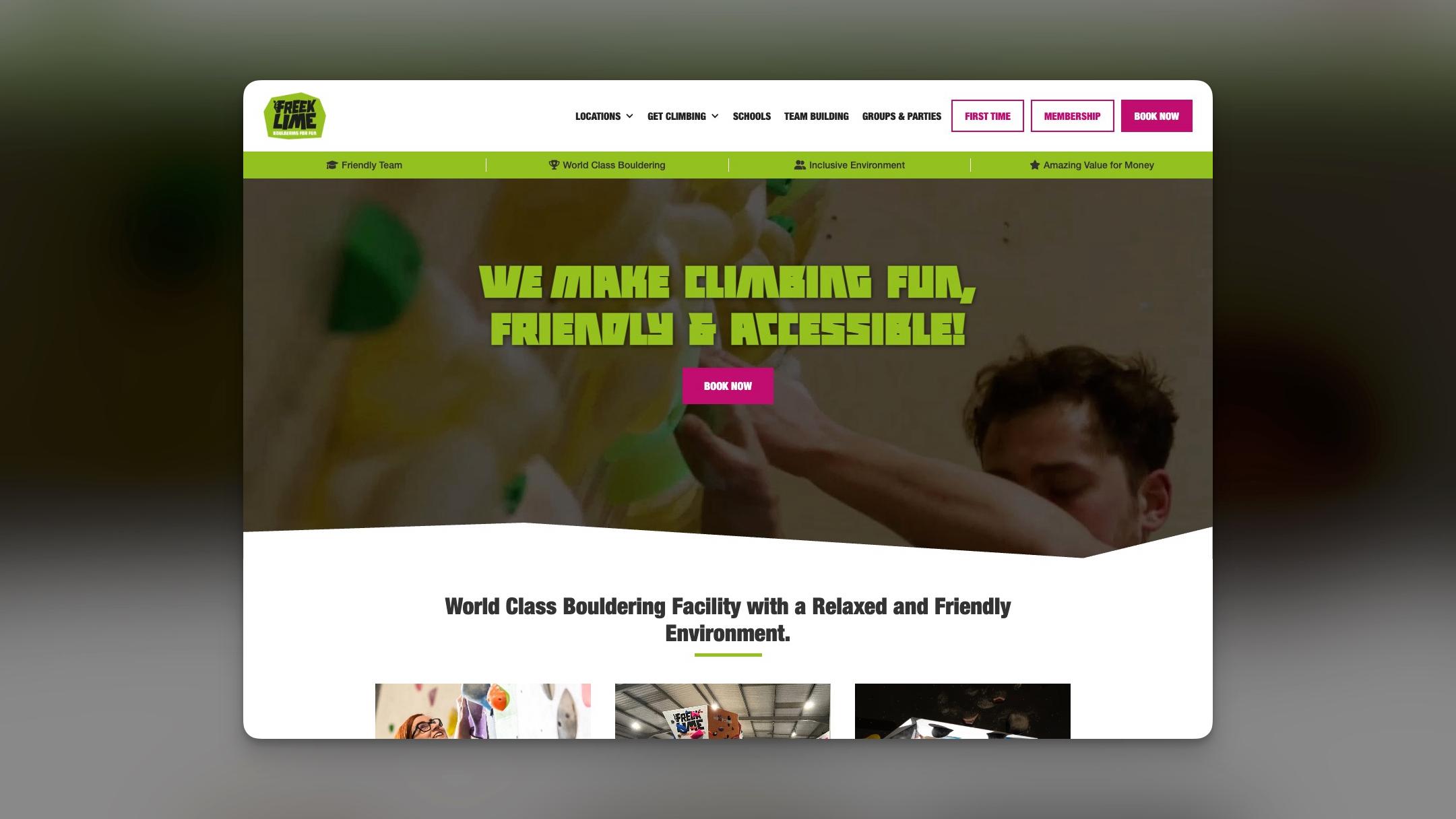
Freeklime had excellent brand assets and was expanding from two sites to three gyms across Yorkshire and Lincolnshire, but the old website wasn’t keeping up.
The site failed to reflect the brand’s quality, made location choice confusing, and left the team without visibility into marketing performance.
- First-time visitors struggled to understand the offering and pick the right gym.
- The strong visual identity and brand guidelines weren’t being leveraged effectively.
- No reliable tracking meant marketing ROI was difficult to measure.
- Navigation and user flows became fragmented as the business scaled.
Solution
From discovery to decision
We rebuilt the site from the ground up with a clean, brand-aligned design, intuitive location-first navigation, and comprehensive analytics baked in from day one.
The result was a clearer, more useful website that made it easier for customers to find the right location and easier for Freeklime to understand what was working.
- Unified brand experience that properly showcases Freeklime’s established visual assets and guidelines.
- Clear location selector and tailored journeys for each of the three sites.
- Simplified navigation and user flows designed specifically for first-time visitors to increase conversions.
- Full end-to-end marketing tracking and analytics so the team can measure ROI and optimise with confidence.
Results
Lasting impact
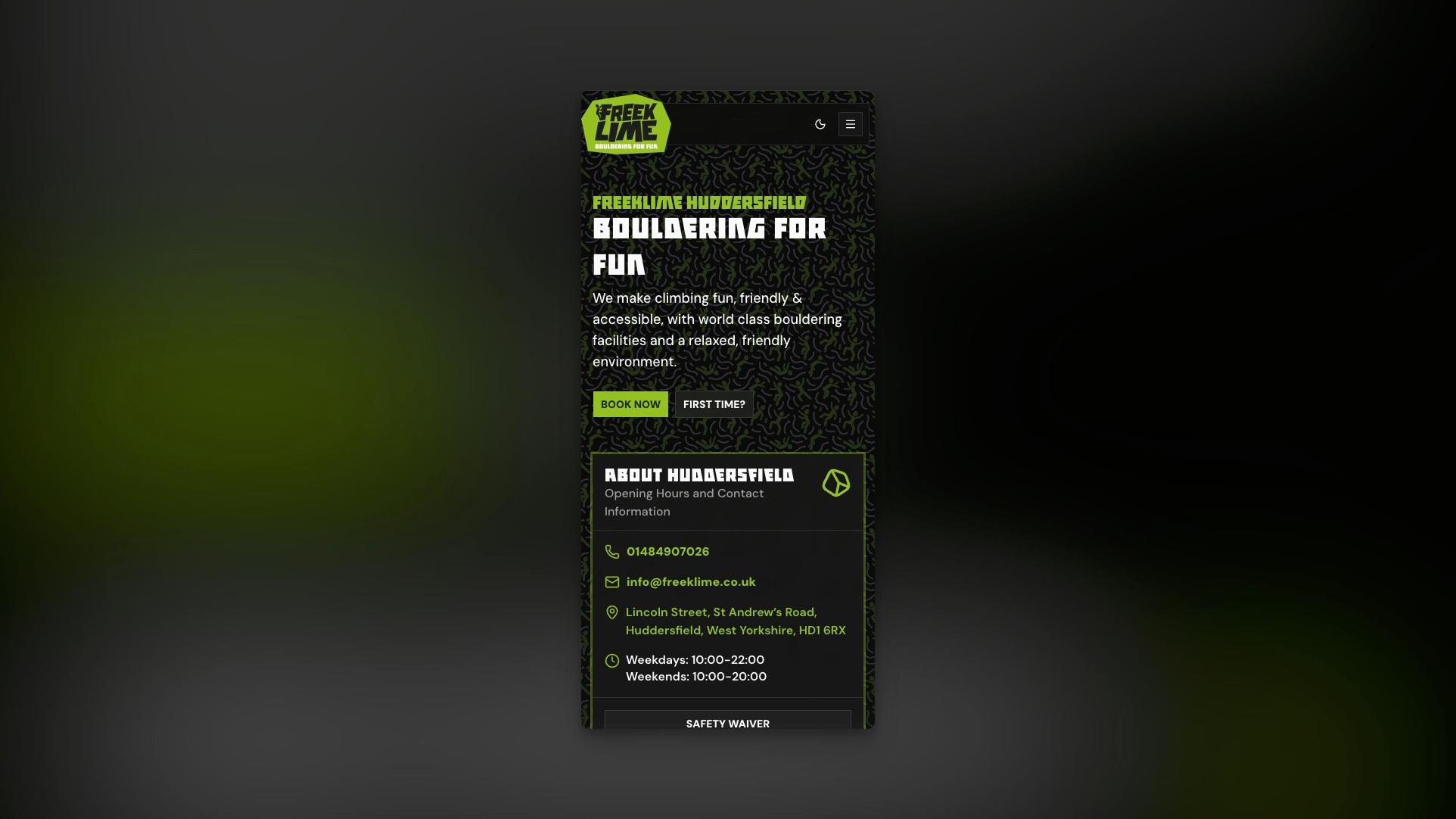
The new site feels like Freeklime—premium, clear, and easy to use. Visitors quickly find their local gym and take action, while the team now has the visibility and foundations to grow the brand across multiple locations.
Location clarity
An intuitive location selector and dedicated site pages help first-time visitors choose the right gym without friction.
Brand alignment
The design now fully leverages Freeklime’s existing brand assets, creating a cohesive, premium experience that matches the quality of the gyms.
Marketing visibility
End-to-end tracking connects ad spend, organic traffic, and campaigns directly to enquiries and conversions across all locations.
Growth website
A flexible, scalable structure with built-in analytics gives the team everything they need to add new sites and continuously improve performance.
Seamless checkout
Streamlined membership sign-up and class booking flows reduce friction at critical conversion points, making it faster for visitors to become members.
Multi-site performance insights
Centralised analytics dashboards let the team compare performance across all three locations, identify winning pages and messaging, and iterate with confidence.
Ready to start?
Let's chat about your project
Schedule a call and we'll talk through your project. No sales pitch, no pressure—just a conversation about what you're trying to build and whether we're a good fit.